Do you want to discover more? Choose your section here !
| Home 🏡 |
|---|
| From creation to reaction 🎨 ➡️ 💡 |
| Uncovering the patterns of the power players of youtube 🔍 📊 🎥 |
| Uncovering shared commenting patterns 👁️🗨️ 📈 |
| Peering Into the Bubbles 🫧👀 |
| Conclusion |
Uncovering shared commenting patterns 👁️🗨️ 📈
As mentioned in the introduction, we are looking to analyze the videos the users in our clusters engage with, to analyze whether these are similar for users within a cluster and different for users of two different clusters. If this is the case, we consider the cluster to be a bubble.
Identification of clusters as bubbles
Let’s take a closer look at whether our clusters can be identified as bubbles.
If particularly active users within the same cluster tend to comment on similar content than a random group of YouTube users, which are commenters in the N&P category, then we can classify our cluster as a bubble. Furthermore, we can compare this same commenting pattern between users within two different clusters. In this case, we expect low similarity which may suggest that the bubbles are isolated. Overall to compare the users we use the pairwise jaccard indices. The higher it is, the more similar it is.
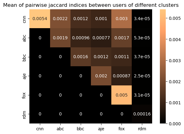
The heatmap confirms that users within the same channel (diagonal values) are more aligned than users across the channels (off diagonal values). Interestingly pairwise interactions within these channels and across the channels are significantly higher than those involving the random group. When we look at the random group’s pairwise interactions, the jaccard index is much lower, which could suggest that our clusters have a more similar commenting behavior than a randomly selected group of users. It should be noted that the random sample has many users which have not done any comments so it is not the best random group for the comparison. To verify this, we will look at similar heatmaps showing instead the 70th, 80th and 90th percentiles of the pairwise jaccard indices between users of the clusters.
We see that the mean similarity for users between users within the same channel is always higher than when comparing users of other channels, except in the case of the abc cluster, where there is a higher similarity comparing the cluster members to cnn cluster members, which is surprising.
We can see that the difference between the mean jaccard index of cluster users compared to themselves to the value for the cluster users compared to members of another cluster is for CNN and FOX. So it seems as if these groups of users have a larger similarity in the content they interact with than the users in the other clusters. We can also see that for the CNN and Fox cluster, the second largest mean jaccard value is when comparing to Fox and cnn, respectively. This shows that while these are the two clusters with the largest similarity within the cluster, they seem to be more similar to each other than to the other clusters.
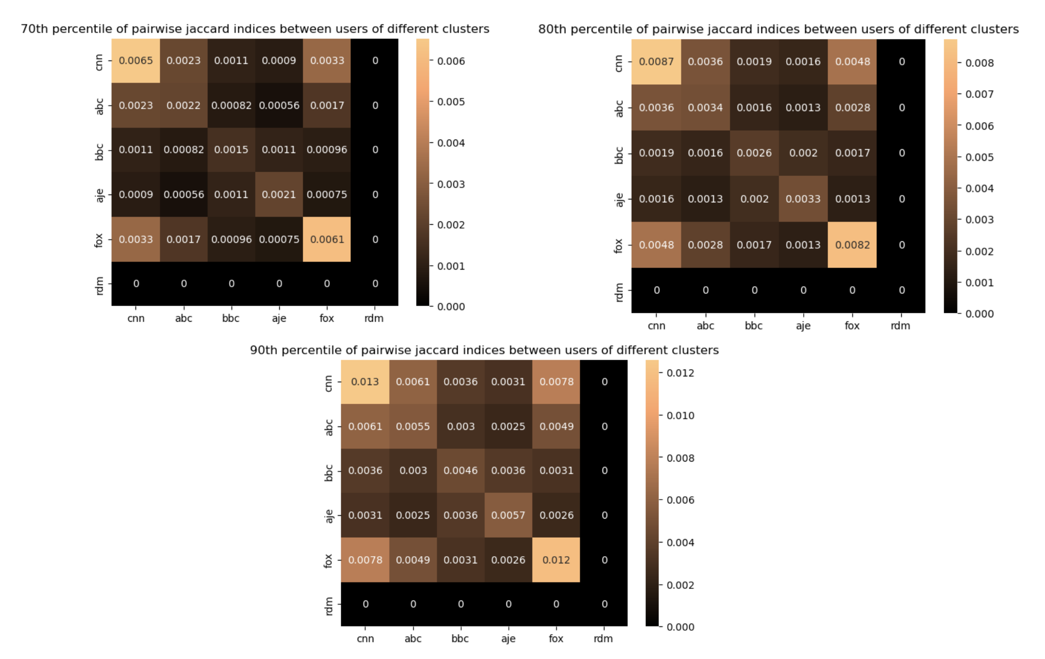
While the similarity within the channels increases with the increase in percentile percentage, the cross-channel interactions remain weak. This reinforces the distinction between the clusters. What about the random users? well they are equal to 0.This means that more than 90 percent of the pairs containing users from the random sample have a jaccard index of zero, meaning no commented video in common, which is clearly different from our defined clusters. This will be related to the fact that many of the users in the random sample will have commented only a small number of comments, which is not the case for the cluster members as they are all among the top commenters. The percentile heatmaps confirm the same indications as the mean heatmap, suggesting that there weren’t any big outliers disturbing the mean value.
After having analyzed the mean jaccard index values and different percentiles finding enhanced similarities within the channels, let’s look at the whole distribution.
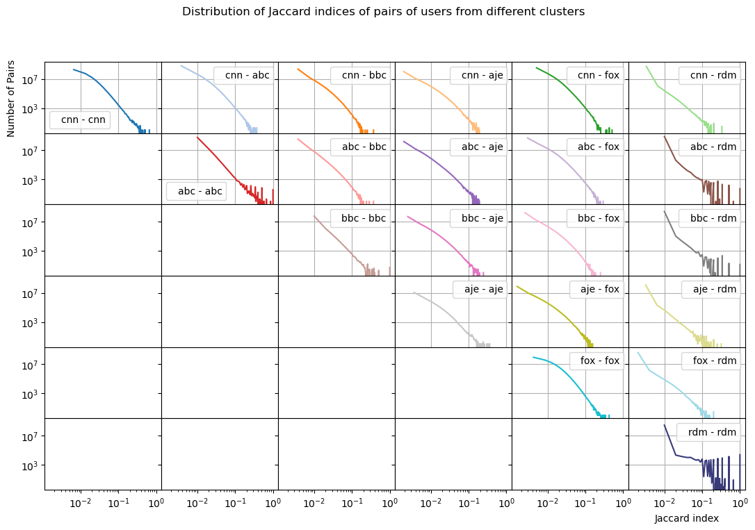
Same-channel pairs have a slower drop off (more pairs for a higher jaccard index) than cross-channel pairs. Additionally looking at the distribution of jaccard indices of pairs of users cluster-random, we see the distributions lose their linearity and variate much more than for the clusters. This shows how the similarity is more random when comparing to users from the random control sample.
Now that we know that there are stronger connections within the channels and a more erratic behavior in the random group, it’s time to connect the dots-literally! The following graph shows the closeness between the 5 clusters and the random sample. The thicker an edge is, the closer the two cluster are.
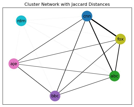
We see that CNN, FOX and ABC are more interconnected compared to AJE and BBC. However all clusters show extremely weak interaction with the random group. This visualizes our previous conclusions about cnn and fox commenters being more similar in their commenting behavior to each other than to users from other clusters, and shows corresponding similarities between the other clusters as well. Therefore based on all the evidence stated above, the clusters are most likely bubbles.
So far we have looked at the big picture of the clusters , but now it’s time to delve deeper into what’s happening inside of them.
Identification of bubbles within clusters.
While our initial analysis provided valuable insights, the clusters were defined by us and did reveal similarities in user activity or content engagement. To refine our understanding of each cluster’s user behavior we now turn to DBSCAN- a clustering algorithm to identify subclusters - smaller, more similar groups of users. Here’s what we uncovered !
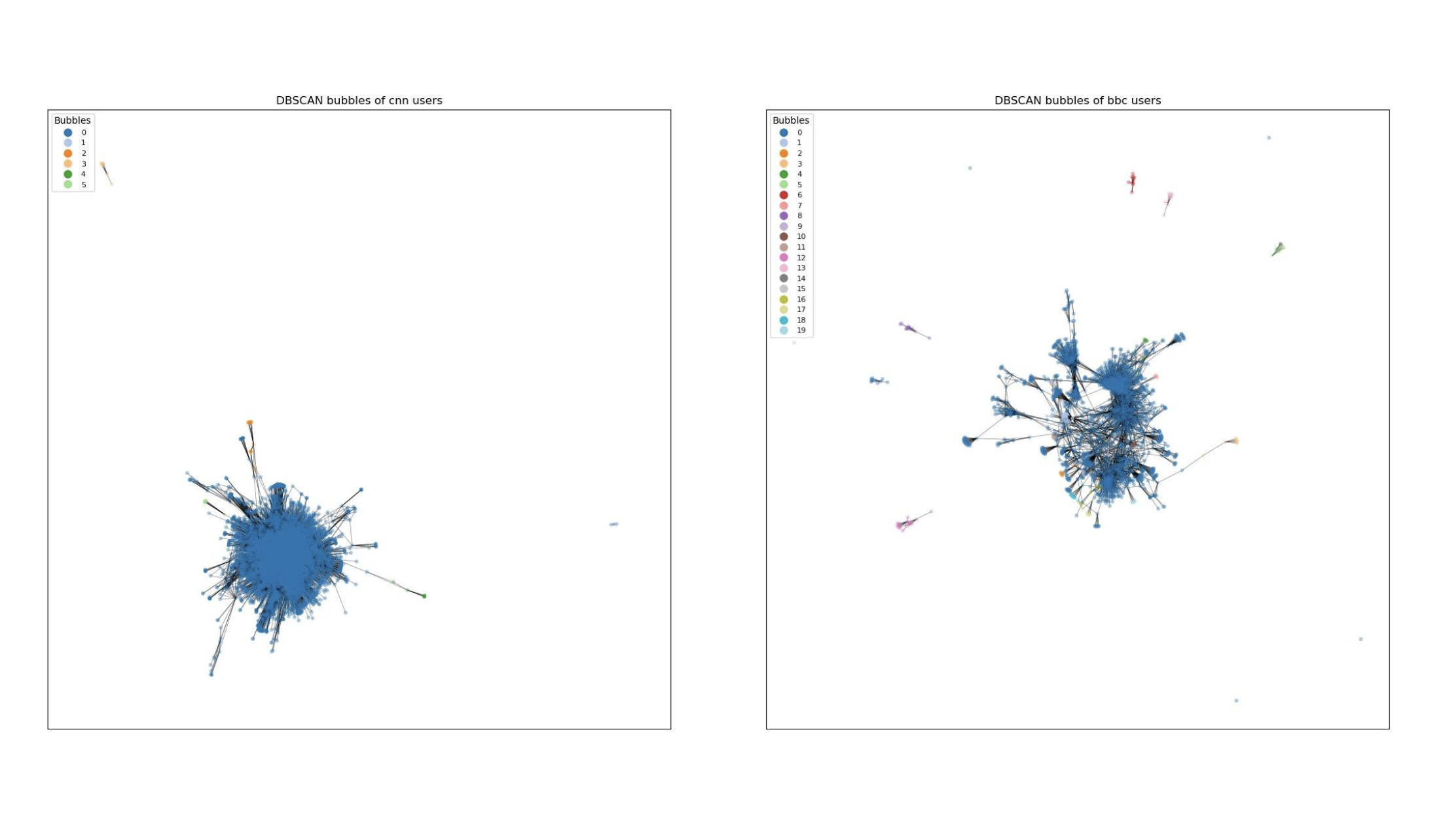
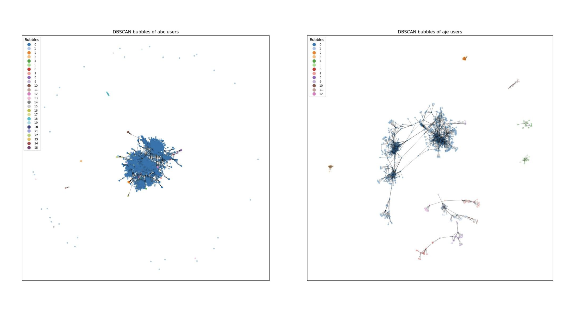
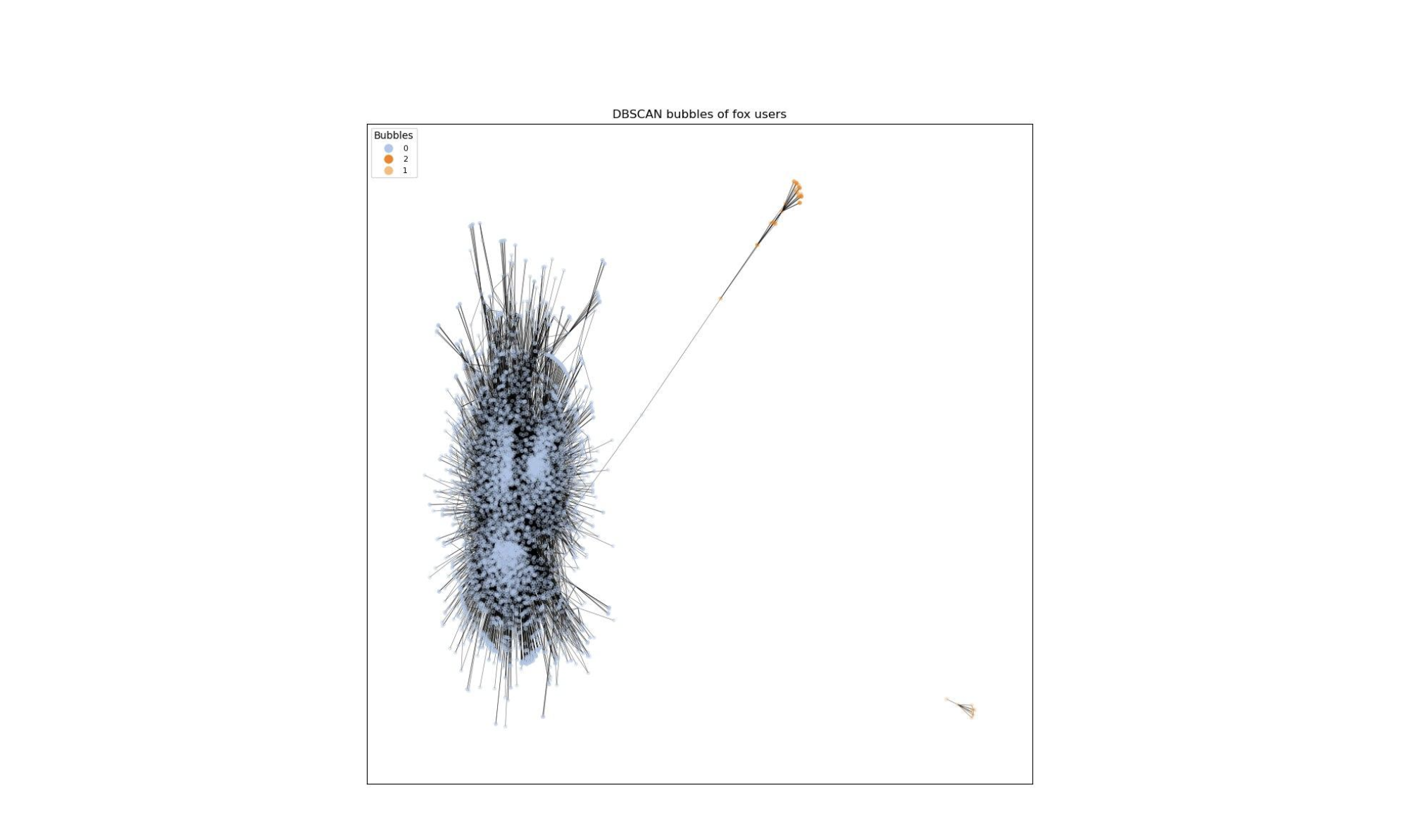
DBSCAN has successfully identified bubbles. All outliers have been regrouped in one bubble which will not be considered in further analysis since our focus is on group tendency rather than individual activities and that we are looking for bubbles but outliers don’t have much in common so they won’t form a bubble. The presence of clear bubbles suggests that there are distinct groups within a channel, each potentially reflecting unique patterns or interests.
Are these subclusters truly bubbles ? Let’s find out by examining the pairwise overlap to see how isolated the behavior of the users within one bubble is from other bubbles and how similar the behavior of users within the same bubble is. To do this we selected the main bubble for each cluster, as it is the most representative bubble, and the other bubbles have a very low number of users. The resulting jaccard indices are shown in another heatmap:
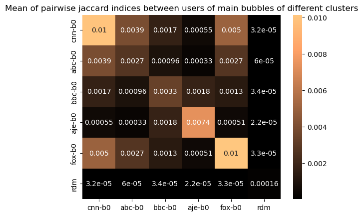
We found similar results as in the previous heatmaps , the off-diagonal terms representing cross-interactions between channels are much lower than the interaction within the bubble, except for ABC again. The same conclusion can be drawn in this sense. However, interestingly, we see that the jaccard indices are much higher than for the original clusters, both for between users of the same cluster and for users from two different clusters. In summary, this plot suggests that the behavior within the bubble is similar while the behavior compared with the other channels is more distinct therefore the DBSCAN’s bubbles are truly bubbles.
With the bubbles now identified, we’ve established the framework to delve deeper into their characteristic patterns.